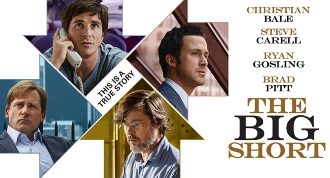
This week I will be looking at an advertisement for the movie The Big Short (2015), directed by Adam McKay and starring Christian Bale, Steve Carell, Ryan Gosling and Brad Pitt. I will be focusing on the typography and the different categories of typefaces the poster uses. The ad uses two different typeface categories. I will explain what these are and how it contributes to the overall design.
Typeface 1

The first typeface used is a modern typeface, shown on the right of the page. We know this for a number of reasons. First, there is a vertical stress in the characters. The clearest evidence of this is in the ‘O’, where I have drawn a line down the middle, noting the vertical stress. The second clue that reveals what kind of typeface this uses is the serifs. We know that both oldstyle and modern typefaces use serifs, but these particular serifs are horizontal. There does seem to be a moderate thick/thin transition which is more indicative of an oldstyle typeface, however, and while the serifs are horizontal, there is bracketing, or a curve where the serif meets the stem.
Typeface 2

The second is a sans serif typeface, seen on the left. It is a very plain and simple design. There is no thick/thin transition in the typeface and, as the name sans serif suggests, there are no serifs hanging off the characters. Because there is no thick/thin transition, there is no stress. Every stroke of each letter has an equal thickness.
Contrast
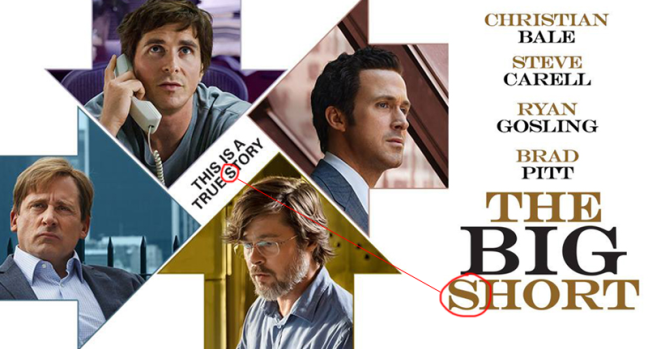
Of course, the biggest difference between the two typefaces is the use of serifs, or the lack thereof. The second most notable difference is the variation of thickness throughout the characters. The starkest example I see is the two capital ‘S’ characters. You can clearly see the differences in thickness, use of serifs and therefore the lack of bracketing.
* * *
The tagline is written in a sans serif typeface that gives it a very simple, easy to read look. Because it is slanted diagonally, the legibility is more important, so this is a better typeface category to use. The title and the actors’ names are written in a modern typeface with at least an element of an oldstyle typeface as well. This gives it a more elegant look that is probably more appropriate for the information.
